IVAN NAVARRO

  • Born in 1972
  • Santiago, Chile
  • Based currently in Brooklyn, NY
  • Medium: lights, mirrors, neon, glowing glass tubes etc
  • Themes & Ideas: Social & political matters, especially in reference to the Chilean government
  • Types of works: Sculptures & installations
  • Art Style: Conceptual, Contemporary

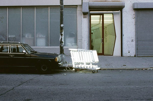
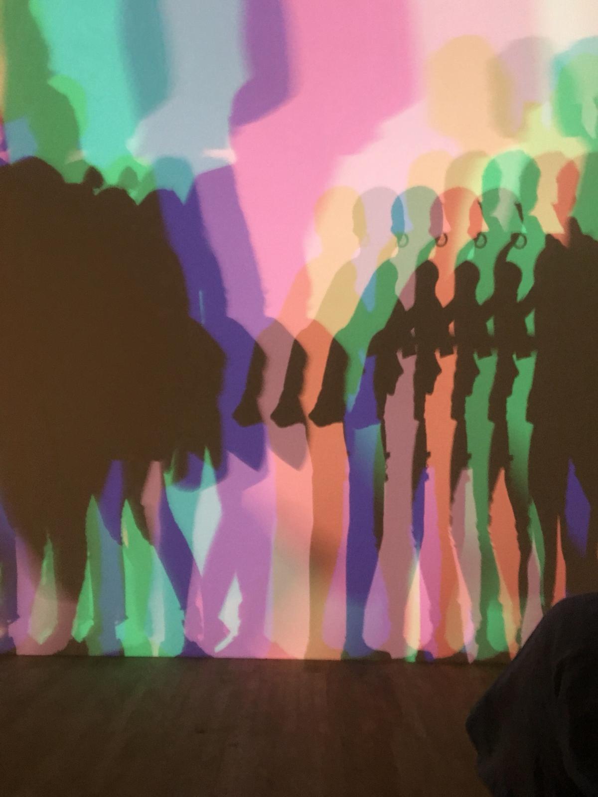
A lot of his work relates to the politics of the Chilean government that he grew up under. Living in Chile, under the dictatorship of Augusto Pinochet (between 1973 and 1990), became Navarro’s most prominent subject matter, Electricity was one of the primary tools used in the dictatorship, to gain political dominance over the country with power being cut off and limited to the Chilean citizens. Navarro uses electricity in his work to represent this. For example, Homeless Lamp, The Juice Sucker 2004-05 in which a florescent shopping cart is lit up with electricity from a municipal power outlet of new York’s Chelsea District. This is in relation to the stark difference of power source/wealth between the rich and the poor (homeless). I like this work because it has a sense of activism, in which the electricity used to power the shopping cart (signifies the homeless), is actually taken from an actual municipal outlet.

Homeless Lamp, The Juice Sucker 2004-05

Another one of his earlier famous works is You Sit, You Die 2002. It was his first version of an electric chair but he has dome more since then like Electric Chair 2005. You Sit, You Die has all the names of the people who have been executed by electric chair in the state of Florida. It’s interesting how the electricity that was limited to the Chilean country is now the medium he uses in his work. I don’t particularly like the idea of using too much electricity because it is a non-renewable energy source. However, Navarro uses it in a important way to bring focus on the political issues of the government. I was particularly interested in his work because a lot of his work looks very cool, especially due to the florescent lights and mirrors. Using light in my work is something I’m interested in aswell.

You Sit, You Die 2002

After looking into his work, I’ve decided that it’s not something I like. Not because of the medium (as I too am interested in working with these specific media) but because of the minimalist aesthetic that Navarro has. His work apparently echoes Dan Flavin (use of florescent lighting) and the minimalist approach. I don’t think that Navarro is as a minimalist as Flavin, as Navarro creates more conceptual works that signifies important challenging values and ideas. But it doesn’t it enough. It has a minimal approach in a sense that the concept is transparent in the visual aspect of the works.

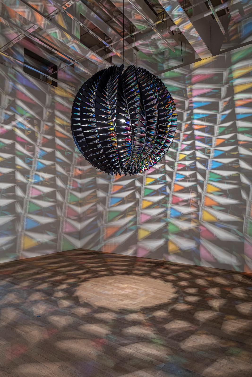
As opposed to just florescent light sculptures, I do prefer his mirror sculptures more. For example, his series Drums 2009-2018 are florescent words fixed around the interior of a drum that has mirrors in the middle. The mirrors make it look like the inside is endless and the word is reflected infinitely. It has a sense of ambiguity because of the endless space created by the mirror. And the fact that words such as ‘BOOM’ are used as an alternate to sound, reflected infinitely. instead of sound coming from the drum, sound is suggested/represented in a way the light is bounced/reflected and echoes in the space. This is really interesting and I like how he uses light to represent something else. It’s really interesting to see how he uses light to represent something else (sound) and how he uses mirrors to manipulate light in a contained space.

Drum Series 2009-2018


GABRIEL OROZCO

Gabriel Orozco is a Mexican contemporary artist, born in 1962, practicing in drawing, photography, videography, sculpture and installations. The subject of his works are usually based around common everyday objects, the reinterpretation and the relationship between humans and material objects. Other subjects that are prominent in his works are anatomy (of animals, insects & humans) and geometric abstraction.

La DS 1993

his work revolves around recurrent themes and explores materials in a way that allows the viewer’s imagination to discover creative associations between aspects of everyday life that are often overlooked or ignored‘.

Lintels, 2001

The essay question that I have decided to do for the first semester is Characterizing the concerns of the Conceptual artists of the 1960’s and early 70’s Lucy Lippard identified the dematerialization of the art-object.  However, more recent conceptual artists have embraced ideas of materiality and visual aesthetics. Focusing on the work of two artists, discuss this apparent shift in concern. and one of the artists that were recommended for me to look into is Orozco. Coming after the time period of the push of ‘dematerialization’ in the art world, Orozco’s interests in material practice were contrasting to his predecessors. He takes influence from the early conceptual artists of the 60’s, especially Duchamp’s ready-mades that mirrors his own works such as Empty Shoe Box (1993), Yogurt Caps (1994) and Lintels (2001).

Yielding Stone, 1992

However, unlike Duchamp, who is interested in displacing the object out of context and placing a new ‘art’ concept, Orozco is interested in drawing in context from the urban environment that the artwork is placed within. He explores how common often- ignored everyday objects interacts in different environments. Empty Shoe Box (1993) and Yogurt Caps (1994) both function as ready-mades placed in an empty space/room, which challenges the audience’s relationship with the space, emptiness, self-awareness, and the body, whilst Lintels (2001) focuses on the repetitive human process through portraying and highlighting the accumulation and fragility of human hair, dead skin cells and debris. Similarly to Yielding Stone (1992), a solid Plasticine clay ball rolled down the streets to accumulate dirt and debris, both works ‘internalises its own impermanence‘. Yielding Stone displays the process of creation whilst Lintels reveals the process of degradation.

Another way he explores the materiality of objects is by questioning the ‘definitions and boundaries of the readymade object in sculptural works, as components of previously living beings are now the basis for creative experimentation and design‘, through inscribing geometric patterns in graphite onto the ready-mades. Black Kites (1997) and Mobile Matrix (2006) are examples of this kind of work that alters and changes the ready-made.


OLAFUR ELIASSON: In Real Life

I didn’t know who Olafur Eliasson was before I went to his exhibition but honestly, it was one of the best exhibitions I’ve seen in a while. I really like this artists. I think it’s because of the themes and the ideas that he challenges and promotes in his artwork. Stuff like real world contemporary issues like the environment e.g. global warming, he isn’t afraid to make work that tackle these subjects, especially because I haven’t seen that many current artists that focuses on the environment in a political viewpoint (in consideration to global warming).

Beauty, 1993

He also challenges the way we perceive the world around us, thus his immersive rooms, huge installations and generally large works. Like the Beauty, 1993 room which is a linear mist of water with lights shining onto it, causing reflections of the light on the water forming a rainbow (prism) across it. Or the Din blinde passager, 2010 which is basically a long hallway completely filled with polyols (sweeteners) fog. So much fog you can only see about a metre ahead of you. Both rooms are so immersive and manipulates your senses. its plays with your senses like the temperature/humidity of the room, the lighting and even the taste (from the fog). Eliasson aims to make us more aware of our senses and in turn, become more aware of the other people around us to ‘form a temporary community’ and a ‘new sense of responsibility’. However, I don’t think he achieved this. I think a lot of people became even more self-aware because you have to rely on your own senses, to navigate around the space. I think for a second, people did become aware of others e.g. as to not bump into each other, but then that lasts only for a short time and then everyone wants a photo for the Instagram story because I can’t deny that his work his ‘aesthetic’.

Model Room, 2003

On the other hand, I also really appreciate his smaller pieces, in reference to the Model Room, 2003 which was basically just an accumulation of little 3D craft structures he built in his studio. I like this one because it reminds me that I shouldn’t be so intent on producing a finalized finished perfect work for exhibiting, but i can allow myself to be playful and unrestricted. Usually, I only think perfect works are meant to be seen in exhibitions but seeing Eliasson’s studio models exhibited challenges my preconception. Also, it’s fun to see how artist’s work within their studios and i can really see his creativeness and playfulness through these models.

I think I really like his work because of the wide range of mediums that he uses and how he uses them. For examples, his use of light to change our perceptions and manipulate what we see, to support his ideas. Its almost like illusions. He takes something simple like shadows and then manipulates how we see the shadows using lights. it makes me question the simple physics of light casting a singular shadow. Add more lights, create more shadows. Change the colour, change the distance, change the subject, it creates this ‘Uncertain Shadow, 2010‘ that’s quite fun. My favourite piece from the whole exhibition is probably Big Bang Fountain, 2014. its in a completely dark room (once again playing with our senses) and in the middle is a water fountain that is illuminates every few seconds for only the quickest amount of time (like a second). Just enough to see the light reflect on the water seemingly frozen in mid-air. It’s so crazy to watch. I had to reach out and touch the water to only get my whole arm drenched in water. I was compelled to touch it because it looked so fake, almost surreal. But this what I mean by his works being almost like illusions. Other works with lights that I like are his kaleidoscopic geometric structures and Your Spiral View, 2002. I like how he titles some of his work with Your, as it makes the experience even more personal and participatory. Its your distorted reflection, your uncertain shadow that you are perceiving.

Big Bang Fountain, 2014 Urcertain Shadow, 2010 In Real Life, 2019

https://s3-eu-west-1.amazonaws.com/olafureliasson.net/objektimages_final/IMG_MDA121844_1600px.jpg

Glacial Currents, 2018

Another one of his interest that shines through his work and a subject that I’m interested in is his concern for the environment, in particular, global warming. Being from Iceland, Eliasson has seen first-hand how ice caps melting have affected the natural environment and its important that he inputs that into his current works. Like the image on the right, is made with actual chunks of glacial ice placed on top of coloured wash pigments left to melt to leave this print on the paper. Hearing about ice caps melting isn’t as shocking (though it should be) than actually seeing it, and this is what we get with this piece.

Other notes: On a curator’s perspective, the exhibition was curated in a way where there isn’t really a structured set flow of movement and you are free to see anything in any order. However, the map given has a recommended route and people generally and naturally follow that given route which causes a bit of queuing. Maybe because I went on a particularly busy time (I went on a Friday Late). Also, the Moss Wall, 1994 in the 2nd room took all the attention from Wave-machines, 1995, because it was the first thing that you notice when you walk in and automatically, the attention surpasses Wave-machines. Not sure how to fix this or if this even that big of a problem, but it is just something I noticed.


SHIT AND DOOM- NO! ART EXHIBITION

This was one of the art galleries we visited on the gallery trip at the start of the year. This left a lasting impression because of the aesthetic it had . It was initially grotesque, messy and almost ‘dirty’. Even the title of the exhibition is very aggressive. I really liked the impact that the artworks had on me and I liked it even more when I found out the meaning behind it. so No! Art is this “radical avant-garde” movement that started in New York, primarily by Boris Lurie, Sam Goodman and Stanley Fischer in 1959. This was an act of rebellion against the capitalist/consumerist ways of society, especially in the art world. This was the time where the Second Industrial Revolution happened, also commonly known as the ‘Technological revolution, which led to the uprise of capitalism in everything, including the art market. The art movements of that time were Pop Art, Conceptual Art etc that were heavily capitalized. No! Art is a stand against that. In a society where people are so blinded by materialistic urges and consumerists tendencies whilst other tragic events are happening around the world (Vietnam War, Atomic Bomb), No! Art aims to shock people into changing their perspective on what art could be, and why only certain types of artworks are publicized and sold on the market. Basically changing what is accepted as art.

Like how Boris Lurie uses a lot of subliminal imagery in his work of collages. Those images of women are taken from magazines & pornography, where the female body is capitalized upon for being ‘ideal, sexy, pretty’ and then collaged in a kind of messy way to reveal how dirty and defiling the process of capitalism is, in a more literal visual way. I like the way Lurie acutally uses real pornographic images because he takes the original form and changes the intended meaning to reveal the truth. Instead of the women being ‘desired’, they are now unappealing to the eye. Instead of having the essence of no power and under the male gaze, the images become empowered. Same with the cemented ‘NO’ on a bra. Cement is commonly known as a industrial material used mostly by construction men. So to be placed on a bra, with each letter on each breast, is a big shout and challenge to the capitalism on women’s bodies (in the media).

I’m not going to lie, I’m not really a fan of these ‘shit’ sculptures. But I think that its a must since the exhibition is literally called ‘Shit and Doom’. Other than the fact that they are actual sculptures of shit, they are also literally quite shit sculptures (as in they aren’t that good – they don’t resemble shit in a very realistic way). However, I think Goodman & Lurie did this on purpose. One reason, though this is a minor reason, is because it is such a big statement to the art world of that time to showcase something so explicit, that they didn’t want it achieve maximum realism. Second reason was because of the idea of No! Art that “It must be unacceptable as art”, in which case shit it. Shit is unaccepted as art. Even now, not many artists represents shit in their art or uses it as a medium or source of inspiration. This work challenges what art is accepted and not accepted. It pushes against boundaries of art, in the most gruesome, shocking but somehow relatable way (i.e. shit and defecation is a natural human process).

I’m not going to lie, I’m not really a fan of these ‘shit’ sculptures. But I think that its a must since the exhibition is literally called ‘Shit and Doom’. Other than the fact that they are actual sculptures of shit, they are also literally quite shit sculptures (as in they aren’t that good – they don’t resemble shit in a very realistic way).

However, I think Goodman & Lurie did this on purpose. One reason, though this is a minor reason, is because it is such a big statement to the art world of that time to showcase something so explicit, that they didn’t want it achieve maximum realism.

Second reason was because of the idea of No! Art that “It must be unacceptable as art”, in which case shit it. Shit is unaccepted as art. Even now, not many artists represents shit in their art or uses it as a medium or source of inspiration. This work challenges what art is accepted and not accepted. It pushes against boundaries of art, in the most gruesome, shocking but somehow relatable way (i.e. shit and defecation is a natural human process).